Feedback On Some Art?

Status
Not open for further replies.

kensai111

Well-Known Member
Hey guys, as some of you may know I work part time designing artwork for the linux distribution Linux Mint. We're working steadily on the next release and the artists are in deep competition in having their artwork featured for the next release. I was hoping to get some feedback on my wallpaper before I turn it in.

Requirements: Must contain the name and logo of the distro (unfortunately)
Follow the specificed color pallette (check)
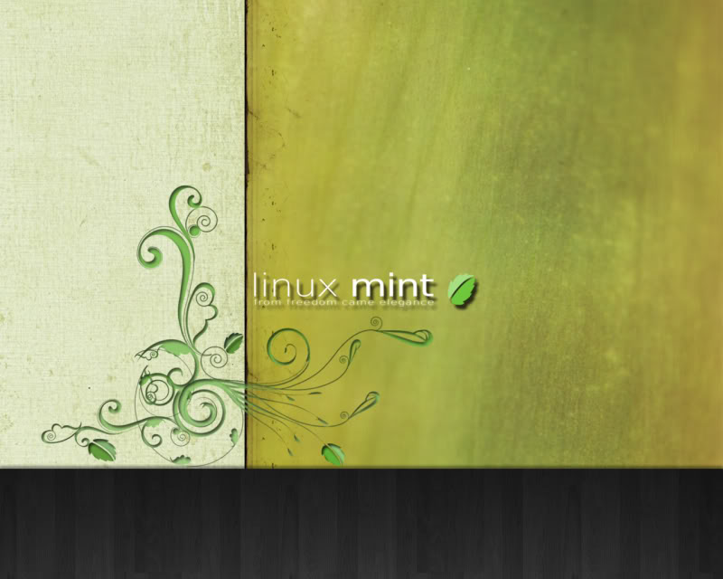
LinuxMint-Natural.jpg


I tried to stay with a theme following the name, a nice earthy tone. I hate having to put the distro's name on it, but I atleast tried to incorporate the design around it.

So, would you enjoy this as a default wallpaper when you first turn on your new computer?

Cheers,
Kensai
 
I tried it, and the the textures/colors aren't very conducive to having icons over top of them. The textured white part on the left made it somewhat difficult to read the names of the icons.
 
well first ill take a quick look at the software and then ill give you some advice/critizisum.

edit
-------------------
ok so from what ive deducted from the linux system and trying the background here... yes it is nice... and then theres the but part... well thest go through the pro's and cons.

pro:
very open and has sort of a rustic country type style to it
good combination of a old parchment style and a peice of wood liike combo.


cons:
it seems a bit to bright for the system.
icons are hard to read
color pallet isnt always nessicary to keep with to the book
add a little blue. open up the area to me i fell a bit closterfobic?


thats all i got for that... it kinda needs a less zoomed in feeling and a more... perspective... a far away view. remember i know i may come off harsh here but its a style that i would see if i was working on grandpa's computer on the farm.. and i doubt grandpa is going to be installing linux mint anytime soon.

sorry if its harsh and all but it needs just that little bit more and at the same time little less, aswell as away from the mother nature side.

thats all i have to say and thats what i'd ask to see but otherwise its an excellent design and i would definately use it in a different application of arts/design than the desktop background!
 
Yttrium said:
I tried it, and the the textures/colors aren't very conducive to having icons over top of them. The textured white part on the left made it somewhat difficult to read the names of the icons.

I forgot to mention this will be used with a theme that I am also required to create so icon colors and lettering will be at my disposal. Thanks for bringing it up though.

Cheers,
Kensai

Edit: Thanks Fluff, thats the kind of things I needed to hear. Unfortunately nothing I can do about the color palette, it's a requirement :\. I'll take another crack at it, they've been using a black theme forever... wanted to get away from that and try something fresh. I'll see what I can do, thanks again.
 
Last edited by a moderator:
Status
Not open for further replies.
Back
Top