- Member DIN
- S068
Armour coatings are the hot topic right now which got me thinking. Then Halloween was close and I needed an easy costume to jump into and out of if I needed to head onto ships during work so I got creative with a thing that was on the shelf of shame. This is what I'm calling my W A V E P O O L JFO lid or possibly B E W E G L I C H K E I T S R U S T U N G P O O L. One definitely has a nicer ring to it. Either way people were asking for a run down of how (also why) I did the gradient. So with that, let's go!
Mandatory listening while reading the thread.
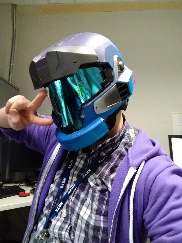
This is kind of going to be a mix of colour theory and painting techniques in one weird chill bundle. A warning now ahead of time that you're going to want to use an airbrush or some sort of spray for this technique, it can be done with a brush but you will have to be much more careful and controlled.
Boring Theory Stuff
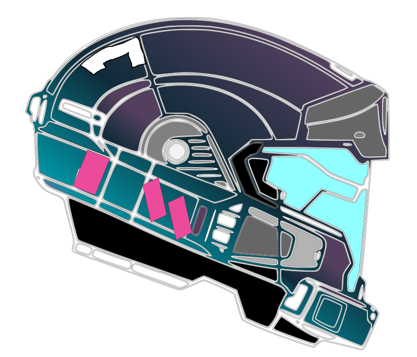
The whole trick behind vaporwave aesthetic is the overuse of colours that were popular in the 80's/90's and a heavy hand of gradients and sharp contrast. Using the colour wheel my colour choices were based on analogous hues which basically means that they're neighbours on the wheel with a contrast of a near complementary colour to the teal by using magenta. The benefits of this scheme is that the analogous colours blend into each other easily and in a pleasing fashion going from dark to light and then the armour secondary colour is a hue that stands out against it's complement which makes for something that pops,
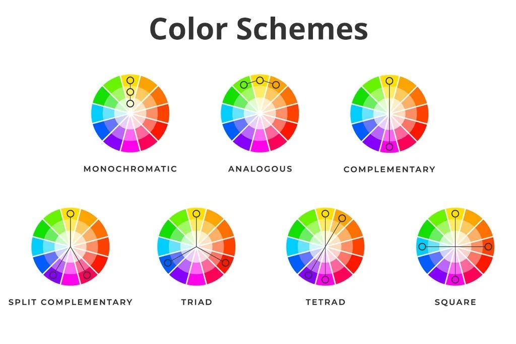
Using a near analogous colour scheme makes for good gradients since they logically transition into one another and choosing colours with successively lighter value makes for easy painting since it's generally easier to cover a lower value (lighter) with a higher value (darker) than the other way around.
For the transition between colours a semi-transparent "zone is needed so that the colours overlap and blend to make a cool effect, this is where glazing comes in. By adding the right amount of thinner to our paints we can create a semi-transparent layer that lets the underlying layers show through which we can abuse to great effect. Working from light to dark in colours we can prepare our coverage areas and make for controlled transitions which we can further exaggerate with extreme base coat layers as shown in the steps below.
Actually Painting the Thing
Shopping list of paints if you want to follow along at home.
For this helmet I had two evenings to paint everything so I used a liberal amount of blow dryer to help things along as well as some creative masking to limit how much work would actually need to be done. Everything was primed black and the metallic colours were added then masked off. From there a primer of white was used on the extreme edge of where the turquoise and magenta will be spending the most of it's time. The white was dusted on from a distance focusing on the lower edges and fading into the upper transition area with the blue.
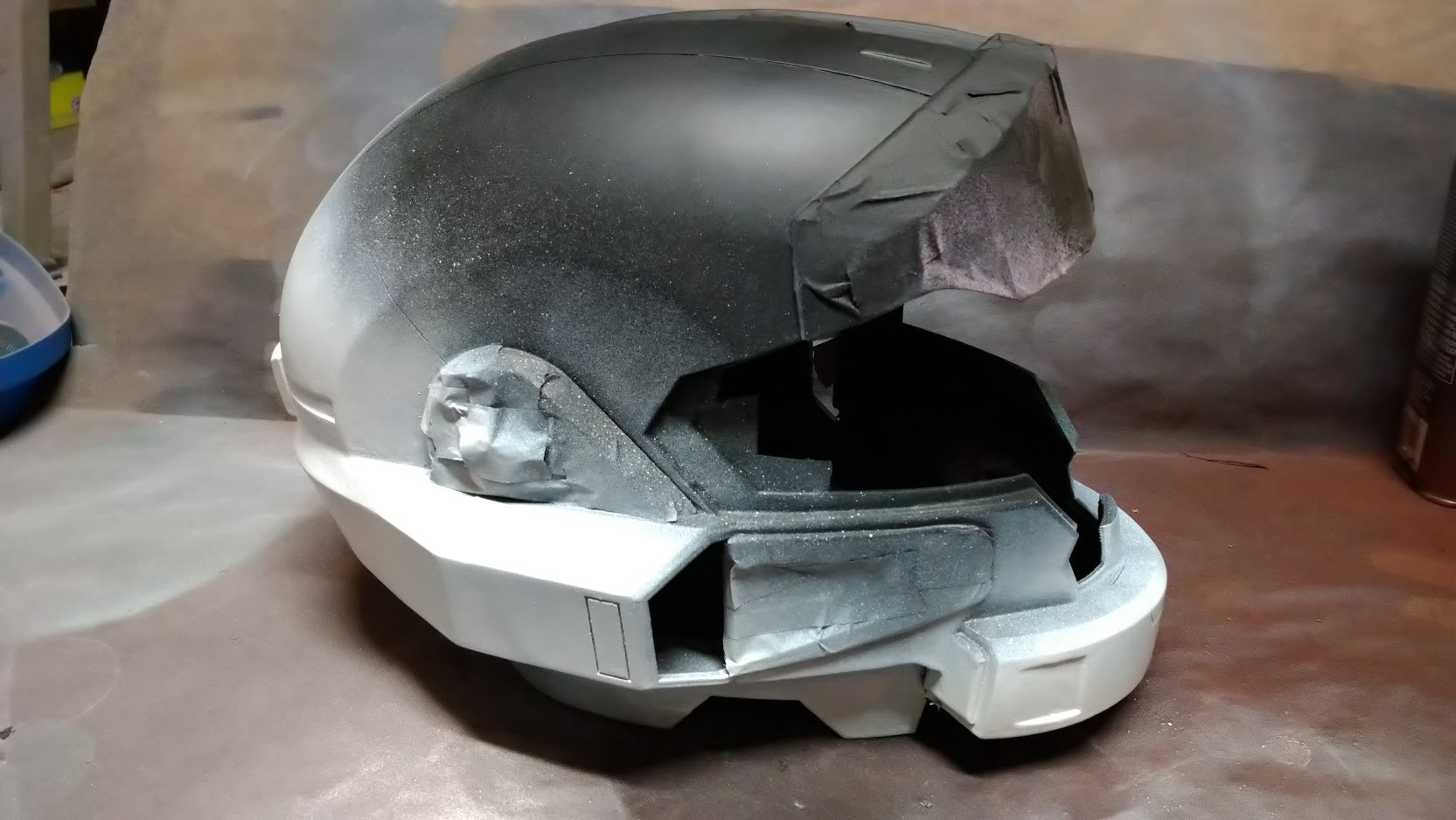
Remembering that we're glazing we want to dilute our paint for our airbrush even more than we normally would with thinner. The Model Color line is intended for brush on application so we'd normal dilute down to the consistency of milk, in this case we want it a little bit more runny than that so I aimed for about a three parts thinner to one part paint ratio. At the early stages here we're okay making some mistakes with our aim so focus on the decidedly white sections leaving a slight band for the transition to the next colour. Work in multiple coats because the paint is very thin and very light to begin with but after three passes it'll pay off. Slowly creep in on the area you want paint to be and everything will work out fine.
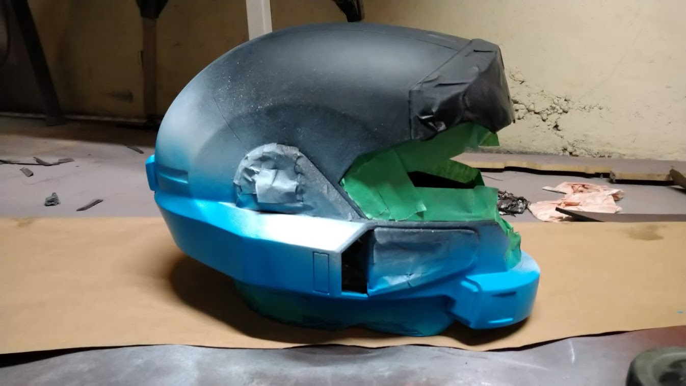
After doing tests with the purple and blue I decided to work with the purple next since it made a really nice tone when the blue went over it and I wanted to keep that. Same as before work slowly but in this case be careful of brush angle and avoid overspray into the turquoise which is not intended to blend into one another.
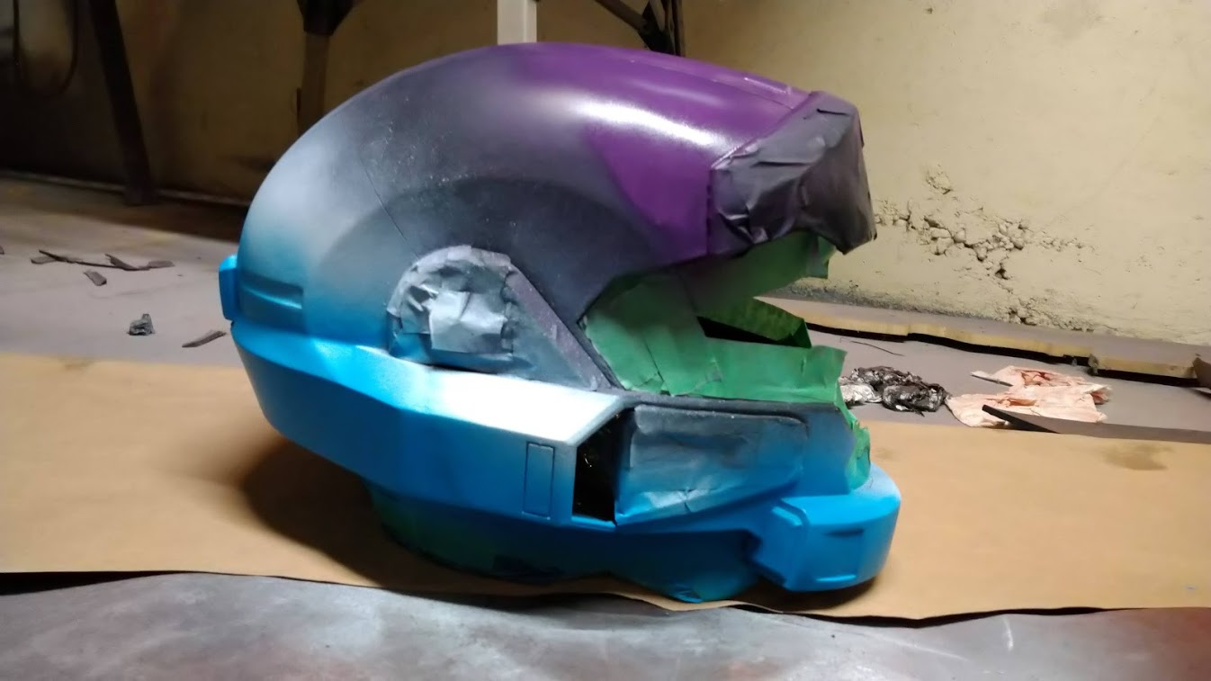
Now for the blue I mixed up the thinning ratio by a bit and got a bit of running along the cheek intakes. Luckily the secondary colours and some chipping damage can hide my crimes. Here we want to hit all the remaining spots and overlap slightly into the other colours for a blend of the tones. Not having to worry about masked off areas and the overall extent of your paint on this third colour makes for a relaxing time that has a really cool result.
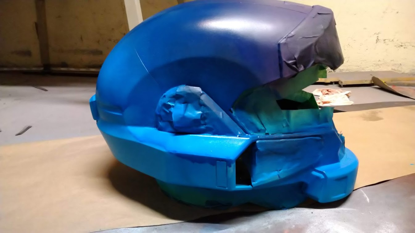
All that's left after this is detailing and slapping in a visor and fans. I'm still undecided on the The Shifters line of paints, they don't quite photograph well and only under certain light sources do the colour shift pigments really shine. Overall though I'm proud with the helmet I made in four days and it got my brain thinking of all the possibilities of Armour Coatings that might appear in Halo Infinite.
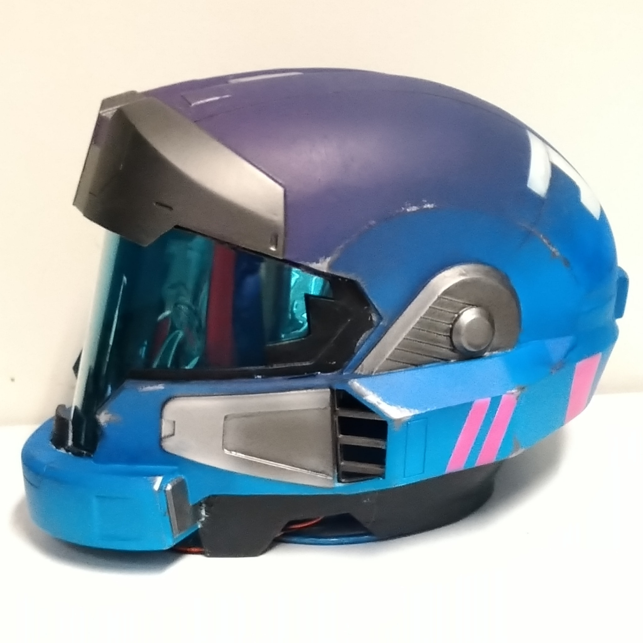
I hope this was somewhat helpful or at least gave some folks inspiration on some non-standard colour schemes that they can add to their characters. No this helmet will not be great for deployment since the colour scheme...
Primary: W A V E
Secondary: A E S T H E T I C
Highlight: Colour shift blue/violet
... doesn't exactly appear in game but I really like it and this is probably one of my favourite buckets I've made yet.
Mandatory listening while reading the thread.
This is kind of going to be a mix of colour theory and painting techniques in one weird chill bundle. A warning now ahead of time that you're going to want to use an airbrush or some sort of spray for this technique, it can be done with a brush but you will have to be much more careful and controlled.
Boring Theory Stuff
The whole trick behind vaporwave aesthetic is the overuse of colours that were popular in the 80's/90's and a heavy hand of gradients and sharp contrast. Using the colour wheel my colour choices were based on analogous hues which basically means that they're neighbours on the wheel with a contrast of a near complementary colour to the teal by using magenta. The benefits of this scheme is that the analogous colours blend into each other easily and in a pleasing fashion going from dark to light and then the armour secondary colour is a hue that stands out against it's complement which makes for something that pops,
Using a near analogous colour scheme makes for good gradients since they logically transition into one another and choosing colours with successively lighter value makes for easy painting since it's generally easier to cover a lower value (lighter) with a higher value (darker) than the other way around.
For the transition between colours a semi-transparent "zone is needed so that the colours overlap and blend to make a cool effect, this is where glazing comes in. By adding the right amount of thinner to our paints we can create a semi-transparent layer that lets the underlying layers show through which we can abuse to great effect. Working from light to dark in colours we can prepare our coverage areas and make for controlled transitions which we can further exaggerate with extreme base coat layers as shown in the steps below.
Actually Painting the Thing
Shopping list of paints if you want to follow along at home.
| Colour | Paint Line | Colour Code |
| Steel | Vallejo Metal Color | 77.712 |
| Gunmetal Grey | Vallejo Metal Color | 77.720 |
| Chrome | Vallejo Metal Color | 77.707 |
| Light Turquoise | Vallejo Model Color | 70.840 |
| Dark Prussian Blue | Vallejo Model Color | 70.899 |
| Royal Purple | Vallejo Model Color | 70.810 |
| Magenta | Vallejo Mecha Color | 69.056 |
| Electric Blue - Intense Violet | Vallejo The Shifters | 77.004 |
For this helmet I had two evenings to paint everything so I used a liberal amount of blow dryer to help things along as well as some creative masking to limit how much work would actually need to be done. Everything was primed black and the metallic colours were added then masked off. From there a primer of white was used on the extreme edge of where the turquoise and magenta will be spending the most of it's time. The white was dusted on from a distance focusing on the lower edges and fading into the upper transition area with the blue.
Remembering that we're glazing we want to dilute our paint for our airbrush even more than we normally would with thinner. The Model Color line is intended for brush on application so we'd normal dilute down to the consistency of milk, in this case we want it a little bit more runny than that so I aimed for about a three parts thinner to one part paint ratio. At the early stages here we're okay making some mistakes with our aim so focus on the decidedly white sections leaving a slight band for the transition to the next colour. Work in multiple coats because the paint is very thin and very light to begin with but after three passes it'll pay off. Slowly creep in on the area you want paint to be and everything will work out fine.
After doing tests with the purple and blue I decided to work with the purple next since it made a really nice tone when the blue went over it and I wanted to keep that. Same as before work slowly but in this case be careful of brush angle and avoid overspray into the turquoise which is not intended to blend into one another.
Now for the blue I mixed up the thinning ratio by a bit and got a bit of running along the cheek intakes. Luckily the secondary colours and some chipping damage can hide my crimes. Here we want to hit all the remaining spots and overlap slightly into the other colours for a blend of the tones. Not having to worry about masked off areas and the overall extent of your paint on this third colour makes for a relaxing time that has a really cool result.
All that's left after this is detailing and slapping in a visor and fans. I'm still undecided on the The Shifters line of paints, they don't quite photograph well and only under certain light sources do the colour shift pigments really shine. Overall though I'm proud with the helmet I made in four days and it got my brain thinking of all the possibilities of Armour Coatings that might appear in Halo Infinite.
I hope this was somewhat helpful or at least gave some folks inspiration on some non-standard colour schemes that they can add to their characters. No this helmet will not be great for deployment since the colour scheme...
Primary: W A V E
Secondary: A E S T H E T I C
Highlight: Colour shift blue/violet
... doesn't exactly appear in game but I really like it and this is probably one of my favourite buckets I've made yet.
