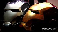
It looks really good. My only problem with the sharkhead version is that it always seemed to big near the very top of the crown. Like that it should curve back in near the top. It makes the bottom of the helmet seem to small and the forehead look a little off to me. I see what you're saying about the eyes on the dungbeetle helmet though. Maybe we need yet another collab 
EDIT: Also, the angle of the chin is a little off. See below

Like I said before. I think your helmet looks great. I don't think either of ours is perfect, though. I hope you don't take that the wrong way.
EDIT: Also, the angle of the chin is a little off. See below
Like I said before. I think your helmet looks great. I don't think either of ours is perfect, though. I hope you don't take that the wrong way.
