Zero 071:
Yeah, in regards to the state flags, I think all of us at one point has looked towards them for some sort of inspiration.
Pretty sure I still have all of them saved to my computer.
I tried to go further by researching to possibly see if there were any logos the military used for infantry divisions (or whatever) in the Southwest.
That said, I think we should decide which shades to do for the colors:
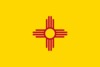
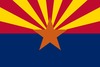
• Yellow - New Mexico (Yellowy Yellow) or Arizona (Slightly Orange-y Yellow)
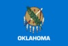
• Red - New Mexico (Crimson), Texas (America Red), or Arizona (Maroon?); Oklahoma also has 2 different shades of red on its flag for consideration
• Blue - Oklahoma (Light Blue), Texas (America Blue), or Arizona (Deep Blue)
• White - Texas (America White), Oklahoma (Beige/Cream)
• Orange (Optional) - Arizona
(fyi, I just kinda made up names for the colors, feel free to correct me)
We've been keeping a theme to the colors we've used in our designs, but we haven't necessarily sat down and formally decided on anything, which is probably something we need to do.
As for the font we should use, I think I remember the PDF of the 405th vector art mentioning that it used Baksheesh, so I think we should stick with it.
I'm also not 100% sure how to respond to what you've said in regards to the Texas Logo or in regards to Termhn's Logo design.
In regards to the logo where I have "Texas" written across the bottom, I simply just added the lettering to see how it would look.
I was thinking that basically, with the logo like that, we could add what our Fireteams/Battalions were at the bottom (Texas, for example) , with "The 405th Southwest Division" shown at the top.
Now, in regards to the Rising Sun logo being "very Arizona-ish", is that a bad thing? I'm not sure exactly what you mean.
MyrHerder:
It's not a bad design, though, the blue for Oklahoma is off in color (in regards to the blue on Oklahoma's flag)
Looking at the design, it might be possible for us to change the laurels around the logo to be Oklahoma's flag's feathers. I vote we test it and see how it looks, then see what Art Andrews thinks.
At the end of the day, there are some things I think we need to consider in regards to the Southwest Logo, and if I leave anything out, let me know, and I'd be glad to list it.
Things we should consider for our Logo:
1) Does the symbol/design identify with the Southwest?
2) Places it will be seen:
• How it will look on Flags/Banners at Conventions
• How it will look on Contact/Info Cards we could hand out to people at conventions so they can look up the 405th online
• How it will look on Brochures (if we make any)
• How it will look on the forums next to our Southwest label
• How it will look on T-Shirts
• How it will look on our armor if we put our Regional Logo on our armor rather than the general 405th Logo (i.e. Stickers & Decals).
3) Should we consider having one design for large things (like banners) and a smaller design for things like business cards and our armor?
4) Should there be a No-Background version of the Logo for things like stickers? (I'm thinking specifically of our armor)
• In regards to #4, I suggest looking at how you select your Emblem in the Halo games, there is the primary portion of the emblem and there is the secondary/background, which can be turned off (such as a Skull sitting in front of a Hexagon), should we allow this?
5) Like Art Andrews has done for the main 405th Logo, should we consider making a basic version of the design that is only 1 color?
With all these things in consideration, before we put a final vote to it, I suggest that we come up with 3 reasonably different design concepts (we have 2 so far), and we work on finalizing them.
So far, we have:
• Rising Sun
• Thunderbird
• (To be determined)
I unfortunately have not revisited working on the Thunderbird design since my last post. I suppose I'll need to check out Inkscape as per Termhm's suggestion.
In part, I was hoping someone else who might have more experience with making logos would step up and make a version based on the concept that I provided.
I would still love it though if we all worked on each of the designs, and then compared them and constructively critiqued them until we have something we are all proud of.
Perhaps for the 3rd design, we could try to take our inspiration from the UNSC Logo, Noble Logo, ONI Logo, In-Game Emblems, and the symbols that were used for Ranks in Halo Reach, using the colors I listed at the top. That said though, I just thought I'd mention it. I don't want to stifle any creativity if someone wants to come along with a 3rd designs that has nothing to do with any of this.