As with so many other things within this community, we are bringing a fresh approach to the look of the core logo.
Logo History
Now... I won't claim to know the entire history of the community's identity, but this is one of the earliest versions of the logo I could find from around August of 2007.

Which eventually appeared on the website around Oct of 2007.

I am not sure exactly when the current logo was first created (roughly ~2008) but Adam shared some of the very earliest versions of it with me:


This triskelion-styled design with three hexagons and the (Halo) ring eventually gave way to our current logo:

Updated Logo
In approaching the new logo, we hired Ever and Oak to help us. Douglas is a friend (and long time RPFer) and understands these type of communities, where a typical design company probably wouldn't truly get the nature of what we do. In talking with him I told him that I did not want a NEW logo as much as I wanted a new take on the existing logo as so many within the community identify with it. I asked him to keep the core elements of the logo:
I also asked that Douglas give us a design that didn't exactly mimic any specific Halo design, but had a feel that would fit into the Halo universe. I also asked him to limit the color palette to two, subdued colors (in addition to black and white) and make the logo something that we could easily break down into more simple forms for various uses. For anyone who knows anything about design, it is much harder to recreate something than to create something from scratch and my list of needs was no small task.
With that being said, Douglas brought back to me a stunning update to our logo that addressed EVERY concern I had and did so in a fantastic way!
I hate to start on a bad note, but before you scroll further (stop scrolling... stop!), PLEASE DO NOT USE THE NEW LOGO FOR ANY IMAGERY AT THIS TIME! Over the next few days, we will be setting up new logo usage guidelines and providing high-resolution artwork for approved usage. Again, please do not use this logo in part or whole at this point!
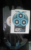
Here is our new full logo for the 405th Division:

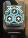
Here is a horizontal variation:

And very importantly, the logo can be broken down into smaller components... such as ranks:

... or it could also be used to represent the progression that so many of us make from small and simply things to complex and difficult things:

And here is just an example of me playing around in Photoshop...

No matter how you look at it, this is a strong update to the community's identity, paying homage to what has come before, while giving us something more versatile and usable for what is ahead!
Here is a chance to see the evolution of the community identity, side by side:

I know I said it before, but I want to remind you again - DON'T SKIP THIS!
While I am confident you are excited about the new logo, PLEASE DO NOT USE IT FOR ANY IMAGERY AT THIS TIME! Over the next few days, we will be setting up new logo usage guidelines and providing high-resolution artwork for approved usage. Again, please do not use this logo in part or whole at this point!
So, where do we go from here? As we continue to update the site and social media venues, we will be adding in the new logo (as well as offering swag with the new logo). We will also be setting new guidelines so you too can use the logo in support of your community!
Logo History
Now... I won't claim to know the entire history of the community's identity, but this is one of the earliest versions of the logo I could find from around August of 2007.
Which eventually appeared on the website around Oct of 2007.
I am not sure exactly when the current logo was first created (roughly ~2008) but Adam shared some of the very earliest versions of it with me:
This triskelion-styled design with three hexagons and the (Halo) ring eventually gave way to our current logo:
Updated Logo
In approaching the new logo, we hired Ever and Oak to help us. Douglas is a friend (and long time RPFer) and understands these type of communities, where a typical design company probably wouldn't truly get the nature of what we do. In talking with him I told him that I did not want a NEW logo as much as I wanted a new take on the existing logo as so many within the community identify with it. I asked him to keep the core elements of the logo:
- The ring - representing Earth.
- The three stars - representing the core values of our community: honor, armor and unity
- The three hexagons - represent you, the building blocks of our community, who hold our values at your core
- The eagle - which has long represented a fighting force, most notably in history, the Roman Legion, but more currently, the US Marine Corps
- The wreath - from the UN and UEG insignia, a symbol of the peace the UNSC are striving toward
I also asked that Douglas give us a design that didn't exactly mimic any specific Halo design, but had a feel that would fit into the Halo universe. I also asked him to limit the color palette to two, subdued colors (in addition to black and white) and make the logo something that we could easily break down into more simple forms for various uses. For anyone who knows anything about design, it is much harder to recreate something than to create something from scratch and my list of needs was no small task.
With that being said, Douglas brought back to me a stunning update to our logo that addressed EVERY concern I had and did so in a fantastic way!
I hate to start on a bad note, but before you scroll further (stop scrolling... stop!), PLEASE DO NOT USE THE NEW LOGO FOR ANY IMAGERY AT THIS TIME! Over the next few days, we will be setting up new logo usage guidelines and providing high-resolution artwork for approved usage. Again, please do not use this logo in part or whole at this point!
Here is our new full logo for the 405th Division:
Here is a horizontal variation:
And very importantly, the logo can be broken down into smaller components... such as ranks:
... or it could also be used to represent the progression that so many of us make from small and simply things to complex and difficult things:
And here is just an example of me playing around in Photoshop...
No matter how you look at it, this is a strong update to the community's identity, paying homage to what has come before, while giving us something more versatile and usable for what is ahead!
Here is a chance to see the evolution of the community identity, side by side:
I know I said it before, but I want to remind you again - DON'T SKIP THIS!
While I am confident you are excited about the new logo, PLEASE DO NOT USE IT FOR ANY IMAGERY AT THIS TIME! Over the next few days, we will be setting up new logo usage guidelines and providing high-resolution artwork for approved usage. Again, please do not use this logo in part or whole at this point!
So, where do we go from here? As we continue to update the site and social media venues, we will be adding in the new logo (as well as offering swag with the new logo). We will also be setting new guidelines so you too can use the logo in support of your community!